A CloudWatch dashboard can be technically correct and still be almost useless during an incident.
I’ve seen plenty of dashboards that amount to a collection of infrastructure graphs:
- EC2 CPU
- RDS CPU
- ECS memory
- Redis memory
- OpenSearch CPU
Those metrics aren’t wrong.
The problem is that they don’t answer the first question I care about when something goes wrong:
Are customers actually being affected?
And if they are, I want the rest of the dashboard to help me answer the next question:
Where is the request failing?
That distinction completely changes how I build operational dashboards.
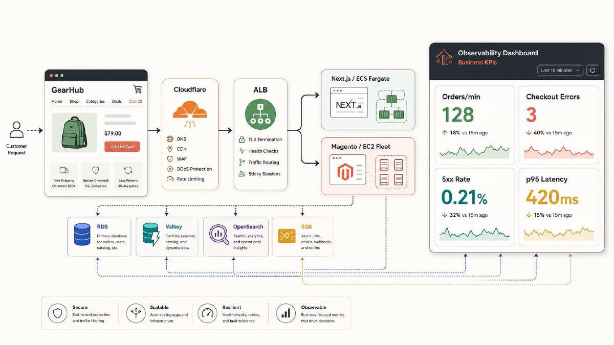
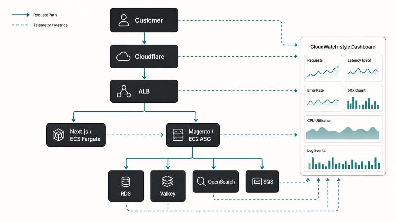
For an e-commerce platform, I don’t want CloudWatch organized like the AWS console. I want it organized like the application.
The general flow I use looks more like this:
| |
The dashboard should follow essentially the same path.
In this guide, I’m going to build one from that perspective.
The finished dashboard will be organized roughly like this:
- Customer impact
- Traffic, errors, and latency
- Next.js / ECS
- Magento / EC2
- Database
- Cache
- Search
- Queues and asynchronous processing
- Application logs
- Distributed traces
This isn’t intended to be a pretty wallboard that looks impressive on a television.
It’s intended to be something I can open during an incident and immediately start narrowing down the failure.
The Architecture We’re Monitoring#
The example throughout this article is based on the kind of architecture I deal with in production.
The frontend is Next.js running on ECS Fargate.
The backend is Magento 2 running across an EC2 Auto Scaling Group behind an Application Load Balancer.
Supporting services include:
- Amazon RDS
- ElastiCache running Valkey
- Amazon OpenSearch Service
- Amazon SQS
- CloudWatch Logs
- AWS X-Ray
Cloudflare sits in front of the platform, but this article focuses primarily on the AWS side of observability.
That distinction matters because CloudWatch cannot tell me everything Cloudflare knows about the request. Likewise, Cloudflare doesn’t necessarily understand what’s happening inside Magento, PHP-FPM, RDS, Valkey, or OpenSearch.
I still want a few edge signals nearby when investigating an incident — Cloudflare request volume, origin error rate, cache hit ratio, WAF activity, and rate-limiting events are especially useful. I generally leave those in Cloudflare rather than trying to force them into this CloudWatch dashboard unless there is a strong operational reason to centralize them.
Cloudflare tells me what is happening at the edge.
CloudWatch tells me what is happening inside the application.
Don’t Start With Infrastructure#
The easiest way to build a CloudWatch dashboard is to open the console and start clicking metrics.
That is also how you end up with 40 graphs and no idea which one matters.
Instead, I start with the questions I want the dashboard to answer.
For an e-commerce platform, mine are roughly:
Is the site working?
Can customers browse products?
Can they add products to their cart?
Can they check out?
Are orders being created?
Is the application getting slower?
Are errors increasing?
Only after that do I care whether CPU utilization happens to be 73%.
Row 1: Customer Impact#
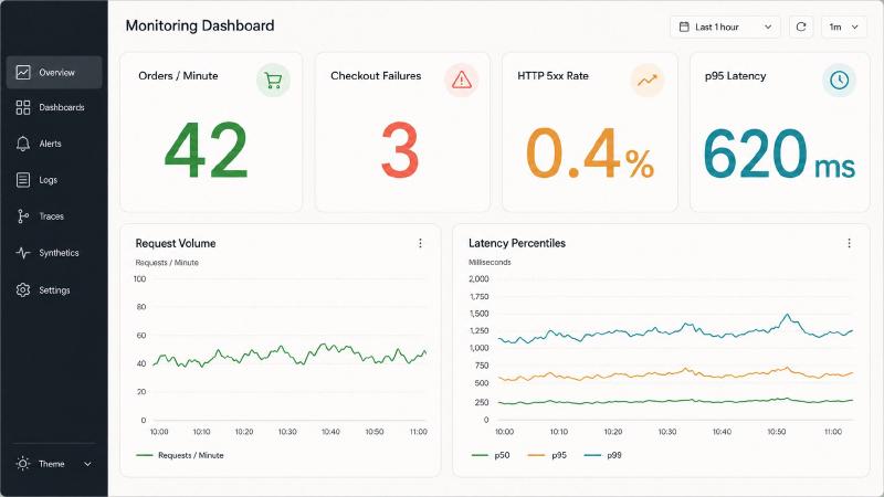
At the very top of the dashboard, I want a handful of large numbers.
For this platform, that means:
- Orders per minute
- Checkout failures
- HTTP 5xx rate
- p95 latency
This gives me immediate situational awareness.
If an alarm fires at 2:00 PM and I open this dashboard, I can quickly distinguish between:
“CPU is elevated.”
and:
“Customers cannot check out.”
Those are very different incidents.
Infrastructure Metrics Are Not Business Metrics#
AWS gives me request counts, errors, CPU, database connections, queue depth, and dozens of other infrastructure metrics.
AWS does not inherently know what an order means.
For important application events, I prefer publishing custom metrics.
A simple namespace could look like:
| |
With metrics such as:
| |
Dimensions should remain deliberately low-cardinality.
For example:
| |
I would not create dimensions such as:
| |
Those belong in logs and traces, not CloudWatch metric dimensions.
Once the application publishes useful business metrics, the dashboard becomes significantly more valuable.
A sudden RDS CPU spike is interesting.
A simultaneous drop in OrdersPlaced makes it urgent.
Row 2: Traffic, Errors, and Latency#
The next row answers:
What is happening to requests entering the application?
For an Application Load Balancer, my baseline widgets would include:
- Request count
- Target 4xx
- Target 5xx
- Load balancer 5xx
- p50 response time
- p95 response time
- p99 response time
- Healthy targets
Why Percentiles Matter#
Average latency is one of the easiest metrics to misuse.
Suppose most requests complete in 150 ms but a meaningful percentage of customers are hitting requests that take several seconds.
The average can still look surprisingly healthy.
That’s why I want at least:
| |
Think of them roughly as:
| |
When p50 remains flat but p99 explodes, I start looking for contention, slow queries, downstream services, exhausted pools, garbage collection, or other bottlenecks affecting only part of the workload.
Calculate Error Rate Instead of Just Error Count#
A graph showing 500 errors sounds alarming.
But:
| |
is very different from:
| |
Metric math lets me turn those raw counters into something much more meaningful:
| |
Conceptually:
| |
This is one of the first derived metrics I add.
Row 3: Frontend — Next.js on ECS Fargate#
For the frontend, I care about both resource saturation and service capacity.
At minimum:
| |
If I enable Container Insights, I can go considerably deeper into task-level and container-level behavior.
For a production Next.js service, I want to see:
- CPU utilization
- Memory utilization
- Running versus desired task count
- Requests per target
- ALB latency for the frontend target group
The important thing here is correlation.
Suppose traffic increases and I see:
| |
Autoscaling is probably doing exactly what I want.
Now imagine:
| |
That tells a very different story.
Maybe autoscaling hasn’t reacted.
Maybe a scaling limit has been reached.
Maybe task placement is failing.
Maybe the application itself has become CPU-bound.
Graphs become much more useful when they are designed to be interpreted together.
Row 4: Backend — Magento on EC2#
The Magento tier is different.
Our backend is built into immutable AMIs and deployed through an EC2 Auto Scaling Group.
That means I want visibility into the fleet rather than obsessing over one specific EC2 instance.
Instances are disposable.
The service is what matters.
I generally care about:
- EC2 CPU
- instance count
- unhealthy instances
- status check failures
- target response time
- requests per target
- target 5xx responses
- PHP/application errors
Avoid Hardcoding Instance IDs#
This is a perfect use case for CloudWatch search expressions.
Instead of building a dashboard around:
| |
I want the dashboard to find whatever instances currently belong to the workload.
Conceptually:
| |
If an instance disappears tonight and another replaces it, I don’t want to edit my dashboard tomorrow.
The observability model needs to understand disposable infrastructure.
One important limitation is that a CloudWatch alarm cannot be based directly on a SEARCH expression because the expression may return multiple time series. That’s fine for dashboards, where dynamic discovery is exactly what I want, but alerting needs a separately defined operational condition.
Row 5: RDS — Where E-Commerce Problems Get Expensive#
Once the application tier looks healthy, one of my next stops is almost always the database.
Magento in particular can make database behavior extremely important to overall application performance.
My basic RDS section includes:
- CPU utilization
- database connections
- freeable memory
- read latency
- write latency
- read IOPS
- write IOPS
- disk queue depth
- free storage
Database Connections Deserve Their Own Graph#
Connection growth is one pattern I always want visible.
A connection leak, badly tuned pool, sudden application scaling event, or slow queries holding connections open can create a cascading failure.
CPU may eventually rise as well.
But connections may tell me what happened first.
Correlate RDS With Application Latency#
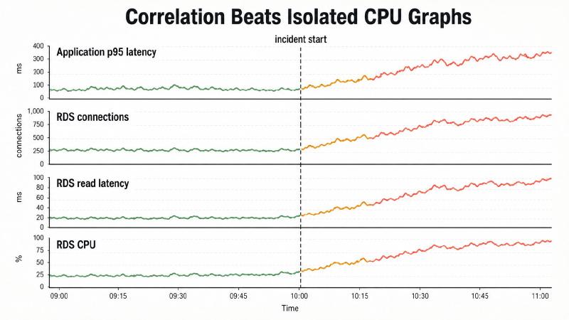
I particularly like putting these graphs close together:
| |
If all four move at the same time, I have a much stronger lead than simply seeing “RDS CPU is high.”
If the problem requires deeper SQL analysis, that’s when I move beyond the dashboard into Database Insights or the database itself.
The dashboard should tell me where to investigate, not replace every specialized diagnostic tool.
Row 6: ElastiCache / Valkey#
Cache problems are deceptive because the cache itself can appear operational while application performance deteriorates dramatically.
For Valkey, my key metrics include:
CacheHitRateEngineCPUUtilizationEvictionsCurrConnections- memory pressure/capacity
- read/write latency where applicable
- replication lag where applicable
CacheHitRate is particularly valuable because it tells me something infrastructure utilization alone cannot.
Conceptually:
| |
Imagine this incident:
| |
Valkey didn’t “go down.”
But the cache stopped doing its job effectively.
That is why behavioral metrics are often more valuable than simple resource-health metrics.
Row 7: OpenSearch#
Search is another subsystem where resource utilization alone doesn’t tell the whole story.
For OpenSearch, I care about:
| |
Depending on the workload I may also include indexing metrics.
Queue and Rejection Metrics Are Extremely Useful#
CPU can look fine while requests are backing up internally.
That’s why I like:
| |
If search latency increases and the search queue starts building, that’s actionable.
If rejections start increasing, even more so.
For an e-commerce site, that can quickly become:
| |
That is much more useful context than simply knowing an OpenSearch node is using 60% CPU.
Row 8: SQS and Background Processing#
Queues need a slightly different mental model.
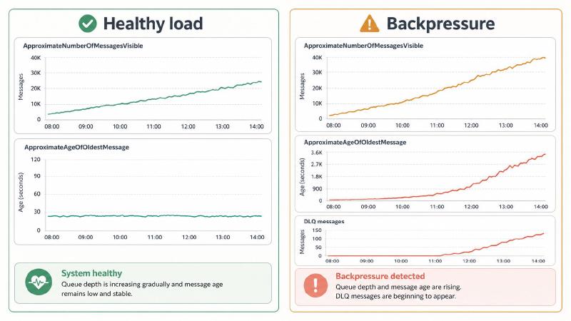
Queue depth by itself is useful, but I care at least as much about message age.
For SQS, my standard widgets include:
| |
Imagine a queue normally processes thousands of messages per minute.
Seeing:
| |
may be completely normal.
But:
| |
probably isn’t.
The combination tells the story.
| |
could simply mean traffic increased and consumers are keeping pace.
But:
| |
looks like backpressure.
And then there is the metric I never want to see:
| |
For important order, inventory, fulfillment, or integration queues, that gets prominent placement.
Row 9: Logs Insights — Put Errors on the Dashboard#
Metrics tell me that something is wrong.
Logs often tell me what is wrong.
CloudWatch Logs Insights queries can live directly on a dashboard, which makes the dashboard a jumping-off point for investigation instead of just a collection of graphs.
If application logs are structured JSON, I can build a widget showing errors over time:
| |
Or show the most common failures:
| |
For a GraphQL API, structured logging becomes especially useful.
If I’m logging fields such as:
| |
I can build a query like:
| |
Now the dashboard can tell me something far more useful than:
| |
It can tell me:
| |
That’s immediately actionable.
Structured Logging Makes Everything Better#
If my logs look like this:
| |
there is only so much CloudWatch can do.
I want structured fields.
For example:
| |
Now I can ask useful questions.
| |
Or:
| |
Or:
| |
Good dashboards start with good telemetry.
No dashboard layout can compensate for an application that emits poor data.
Row 10: X-Ray and Distributed Tracing#
Metrics tell me something became slow.
Logs may tell me an error occurred.
Distributed traces tell me where the request spent its time.
For an e-commerce request, I want to be able to follow something conceptually like:
| |
Now the investigation changes from:
“Magento is slow.”
to:
“Magento spent 1.8 seconds waiting on search.”
That’s a dramatically better problem statement.
I don’t need an enormous trace visualization permanently occupying half of the dashboard.
I need enough tracing context that once the high-level metrics point toward an application path, I can jump into X-Ray and inspect representative slow or failed requests.
Build the Dashboard as Code#
Once a dashboard becomes operationally important, I don’t want its only copy living in somebody’s AWS console.
I want it in Git.
I normally keep something like this in the infrastructure repository:
| |
That gives me:
- code review
- Git history
- reproducibility
- rollback
- consistent environments
- no mystery console edits
If somebody destroys the dashboard layout while investigating something at 3 AM, I can restore it from source control.
A Smaller Dashboard Definition#
The full dashboard JSON gets large quickly, so I don’t think dumping the entire production definition into an article helps much.
Instead, here is a representative section showing the patterns that matter: a business KPI, a derived error rate, and a dynamic EC2 fleet metric.
| |
The complete definition belongs in the repository alongside the infrastructure that owns it, not buried in the middle of a blog post.
I can deploy that dashboard directly with the AWS CLI:
| |
Or let Terraform own it:
| |
The exact metrics will change from platform to platform.
The structure is what matters.
Use Dashboard Variables Where They Actually Help#
CloudWatch dashboard variables can change metric dimensions or other properties throughout a dashboard.
That makes it possible to reuse the same dashboard for things such as:
| |
or:
| |
Property variables are generally the cleaner option when a resource is identified by a specific JSON property or metric dimension.
Pattern variables are more powerful but also easier to abuse because they perform substitutions against the dashboard definition itself.
My preference is to use variables where the architecture is genuinely identical.
I don’t try to create one magical dashboard that represents every application, environment, AWS account, and Region.
At some point reuse becomes obscurity.
How I Choose Widget Sizes#
I intentionally vary widget sizes.
Important single values belong at the top.
| |
Trend graphs usually need more horizontal space.
| |
Dense diagnostic graphs may deserve the entire row.
| |
The layout itself communicates importance.
I don’t want a CPU utilization graph occupying the same visual priority as checkout failure rate.
Set the Default Time Range for Incidents#
For operational dashboards, I usually prefer opening with a relatively short recent window.
For example:
| |
Three hours gives me enough context to see what normal looked like before an incident while still keeping short-lived spikes visible.
During an investigation I may switch to:
| |
depending on the problem.
A 30-day graph is excellent for capacity planning.
It’s terrible for finding a 90-second production failure.
Decide Separately What Deserves an Alarm#
A useful dashboard and a useful alarm strategy overlap, but they are not the same thing.
A dashboard helps me investigate.
An alarm tells me that a condition deserves attention.
For this architecture, I would strongly consider alarms around:
- sustained HTTP 5xx rate
- unexpectedly low order volume during normally active periods
- elevated checkout failure rate
- unhealthy ALB targets
- ECS service capacity problems
- RDS capacity or latency problems
- critically low database storage
- Valkey evictions or severe memory pressure
- OpenSearch red cluster state
- OpenSearch search rejections
- SQS oldest-message age
- DLQ message count
- failed smoke tests after deployment
But thresholds need to come from the application.
There is no universal:
| |
rule.
A service designed to efficiently run at 80% CPU might be perfectly healthy.
A checkout service returning 15% errors at 12% CPU is definitely not.
Gotcha: Too Many Metrics Can Make the Dashboard Worse#
Once you discover how many metrics CloudWatch exposes, there is a temptation to add all of them.
Don’t.
A dashboard with 70 graphs means I effectively have no dashboard.
I have another monitoring console.
Every widget should answer a question.
For example:
| |
| |
| |
If I cannot explain why I need a graph, I remove it.
Gotcha: Averages Hide Bad Behavior#
This deserves special attention in high-volume systems.
If I graph only:
| |
I can hide painful customer experiences inside millions of otherwise fast requests.
Use percentiles.
Look at distributions.
Separate important application paths when possible.
A fast product-image request should not make a painfully slow checkout operation appear acceptable.
Gotcha: Dynamic Infrastructure Requires Dynamic Dashboards#
Hardcoding EC2 instance IDs into an Auto Scaling environment is a maintenance problem waiting to happen.
The same principle applies anywhere resources are ephemeral.
Use:
- meaningful dimensions
- service-level metrics
- Container Insights
SEARCHexpressions- resource tags where appropriate
- stable workload identifiers
Monitor the service, not yesterday’s server.
Gotcha: Metrics Without Context Create False Leads#
Suppose this happens:
| |
Is that bad?
Maybe.
Now add:
| |
I’m interested, but I’m probably not declaring a production incident yet.
Now change the surrounding metrics:
| |
That’s a completely different situation.
Dashboards create value through correlation, not individual graphs.
The Dashboard Should Mirror How You Troubleshoot#
When something breaks, I don’t troubleshoot alphabetically by AWS service.
I start with the symptom and follow the request down the stack.
Is the customer affected?
Are requests failing or becoming slow?
Is the frontend healthy?
Is the backend healthy?
Is the problem in RDS, Valkey, OpenSearch, or asynchronous processing?
What do the logs say?
What does the trace show?
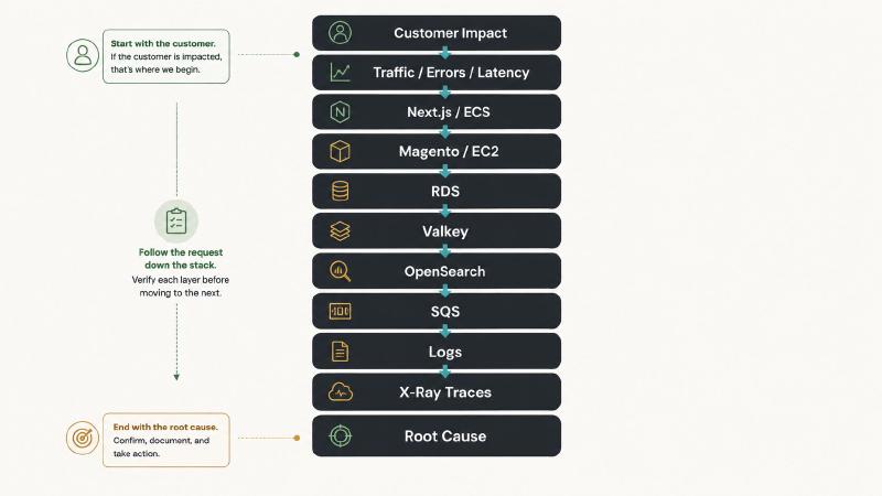
That investigation order is what turns CloudWatch from a pile of AWS graphs into an operational tool.
Final Thoughts#
CloudWatch gives us an enormous amount of telemetry.
The difficult part isn’t collecting graphs.
It’s deciding which signals matter and arranging them so an engineer can understand the health of a complicated system quickly.
A useful dashboard should be able to turn:
“The website is slow.”
into something closer to:
“Search is saturated, OpenSearch requests are being rejected, and that is driving backend latency.”
That is the standard I use.
Start with what the customer experiences, follow the request through the system, and use each widget to eliminate possibilities until the failure has somewhere specific to live.
If a dashboard can’t help me narrow an incident down, it doesn’t need another graph.
It needs a better design.